← All work
Fresh produce import & export · Netherlands
Cherryland
- Scope
- Brand identityVisual languageCampaign posters
The brief
A Dutch import–export house moving fruit and vegetables between continents needed to look like what it is: precise, fresh and global — not a wholesaler's price list. We built the identity around one line, from our farm to yours, and gave it a system that could carry both the greenhouse and the shipping lane.
What we made
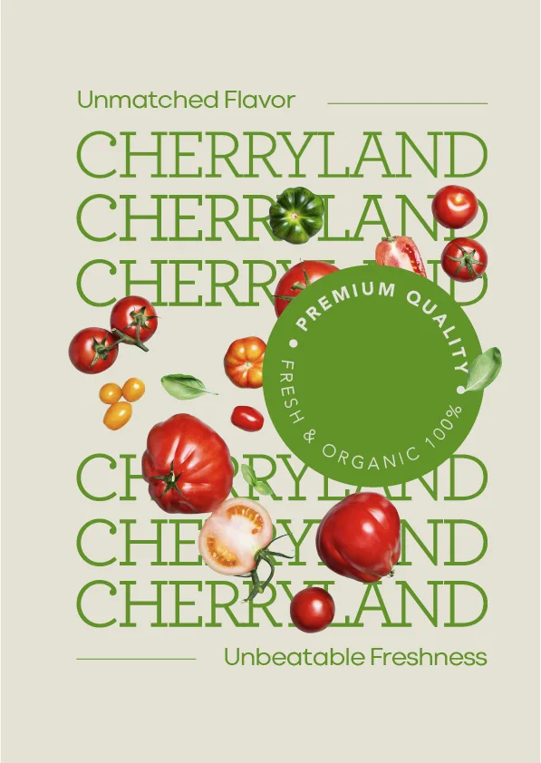
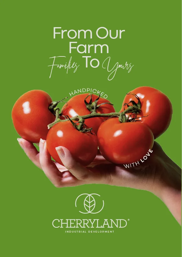
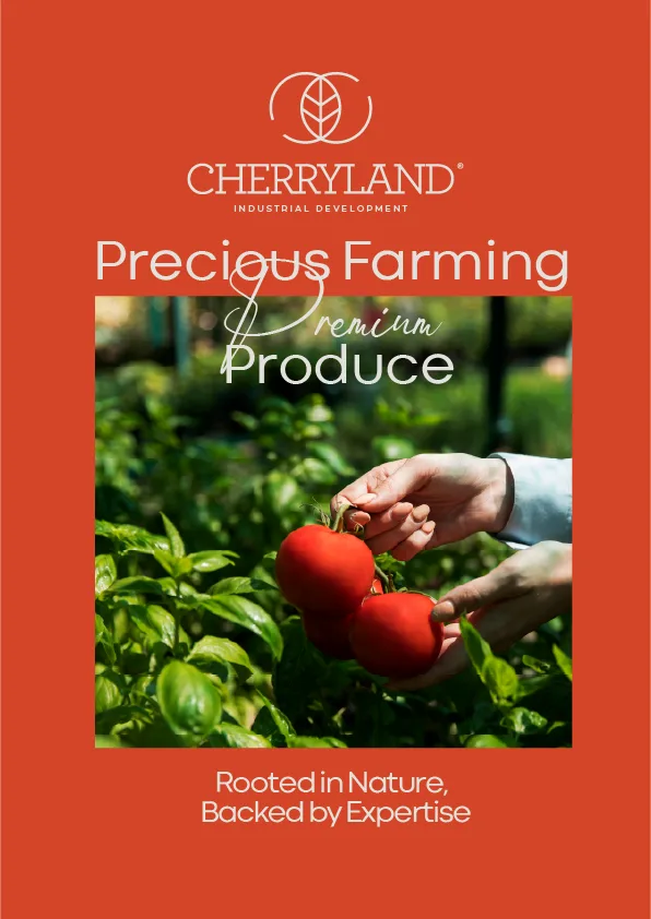
The leaf-in-a-circle mark and the CHERRYLAND wordmark. A three-colour palette — field green, tomato red, cream — that switches mood without losing the brand. A type system pairing a clean grotesque with a hand script for the human lines. And a poster series that runs from a single tomato to a continent.
Palette
- Field green#6B9E3A
- Tomato#E44E2C
- Cream#F0ECE1
- Leaf#2F5A2A
The work
6 pieces